Where The Flying Things Go
The design for this mosaic was a culmination of ideas and past work. I was still working out how I was going to put it all together when one day last week the sky gave me the final piece of the puzzle and the motivation to start. This was how the sky looked that day:
I made a quick coloured sketch. I wanted to use some of the motifs I have used in previous mosaics; birds, butterflies and Bella, and I added to them bees, a Boeing (beginning to see a connection?) , and I added a few more flying things that don’t begin with B (see if you can spot them).
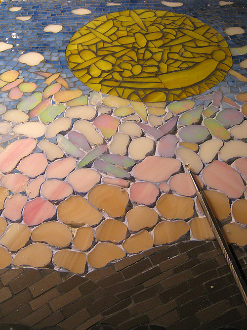
As I began the mosaic I decided to use some pinks and iridescent glass as well as white for the clouds – sunrise colours. I also began to stack the clouds together as they were in the photo, instead of spacing them out like in my drawing.
I thought I would try out some blue grout around the clouds and flying things, but as you can see it didn’t work:

It’s a bit …how can I say it … yuck! From my experience coloured grouts can work well when used with similar colours and tones, for instance in How the Sun Wakes Up and in Larks.
But in this case although some of the tones of the glass have a similar value to the tones of the grout, the hues are different. However I think the main reason why the overall picture doesn’t work is because the clouds and flying things are not defined enough. It needed black grout to define the shapes like the shapes in the sun.
So to plan B after digging out the blue grout which is still soft after I have had my dinner due to the acrylic paint I added to it.
Plan B = filling in the spaces with blue glass.
🙁
Sometime later, I re-grouted in black:

Come back soon to see another mosaic inspired by that mackerel sky!
🙂


The finishing touch to all great mosaics: black grout (well, actually charcoal). That’s my opinion anyway–but now you’ve gone and reinforced it! Love this mosaic keep up sharing the great work. 🙂
Hi Bev. Yes, black or charcoal grout can finish a mosaic beautifully by making the colours pop, but neutral greys can be more successful with subtle combinations of colour. I have used the black in this mosaic to define the shapes within the single blocks of colour like a black pen would in a drawing. Thanks for reading and the encouragement. 🙂